


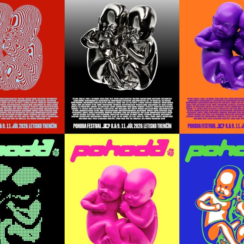
One festival, two babies, three dimensions
Pohoda, held in Trenčín, Slovakia since 1997, is one of Europe's leading festivals, where music meets literature, dance, visual arts, film and theatre, while providing a platform for important social and cultural issues — creating a rich, multidisciplinary experience. In 2026, Pohoda celebrated its 30th anniversary edition. To mark the occasion, a new visual identity was created, which we want to present in more detail in this article — from its initial concept and the return to the festival's iconic symbol, to the way it gradually made its way into every layer of Pohoda's communication.
24. August 2026
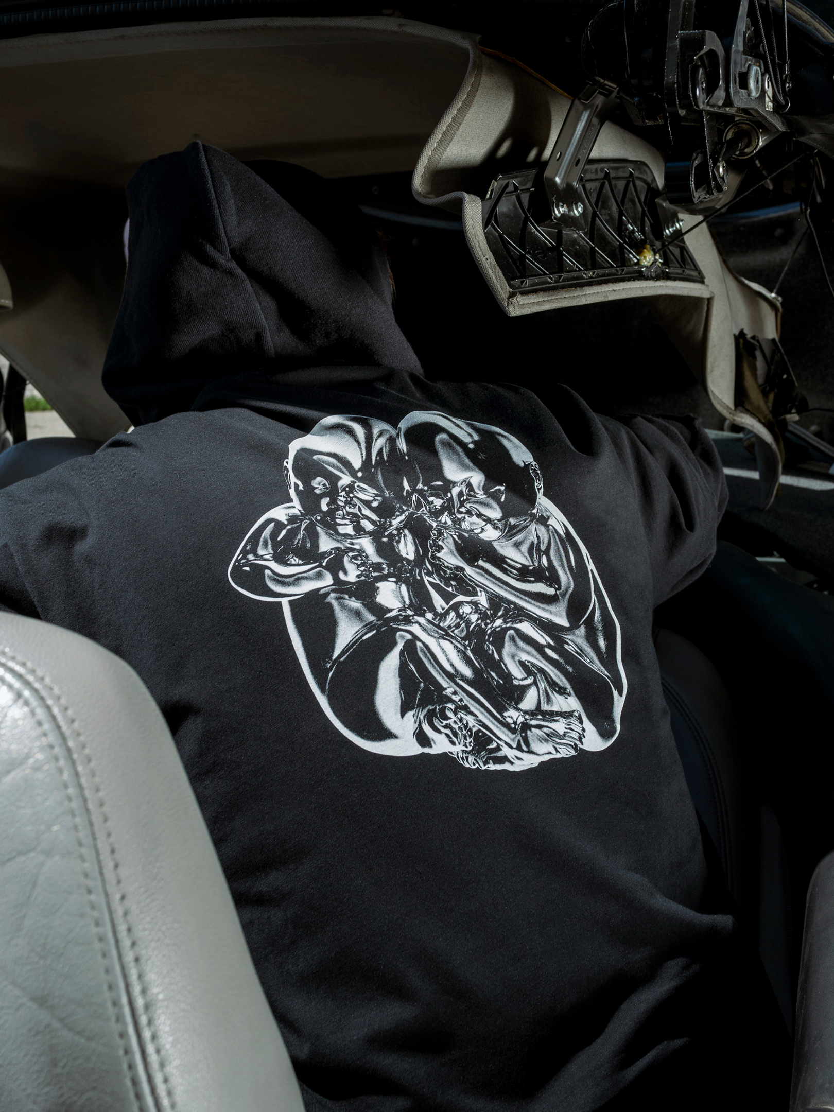
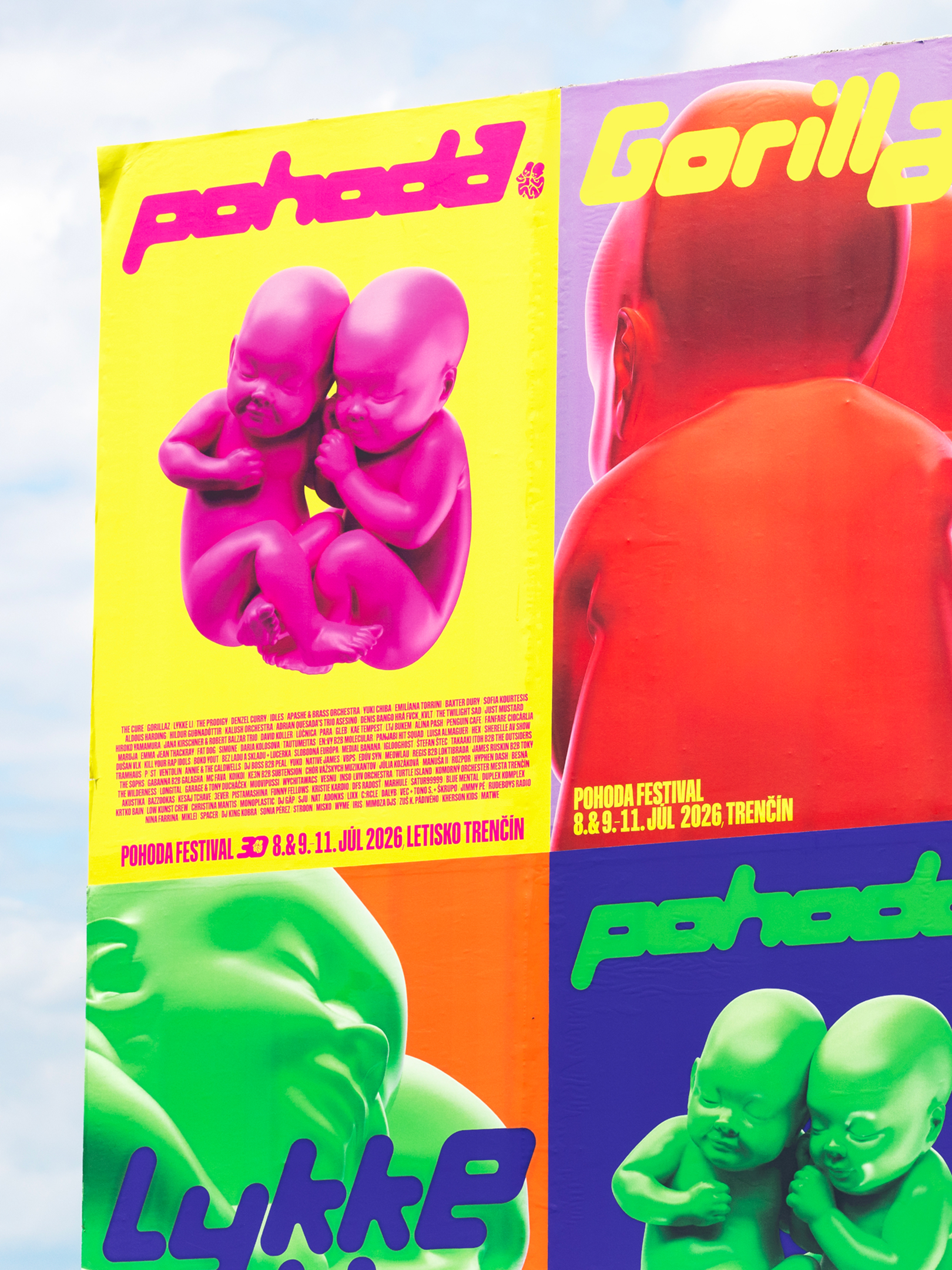
The foundation of the new identity is the iconic "babies," who have been associated with the festival practically since its beginnings and embody its atmosphere, values, and message of love, openness and togetherness. Their new three-dimensional form, together with a custom typeface, created a visual system that was subsequently carried through into the logo redesign, typography, graphic outputs and social media posts. It was also reflected in advertising campaigns — from print and billboards to digital communication — and became the basis for a merchandise collection created specially for the anniversary edition.
Logo
The motif of two babies first appeared on the festival’s original poster in 1997. The original photograph was later transformed into a simple two-dimensional mark, becoming an integral part of Pohoda’s identity and remaining unchanged ever since.
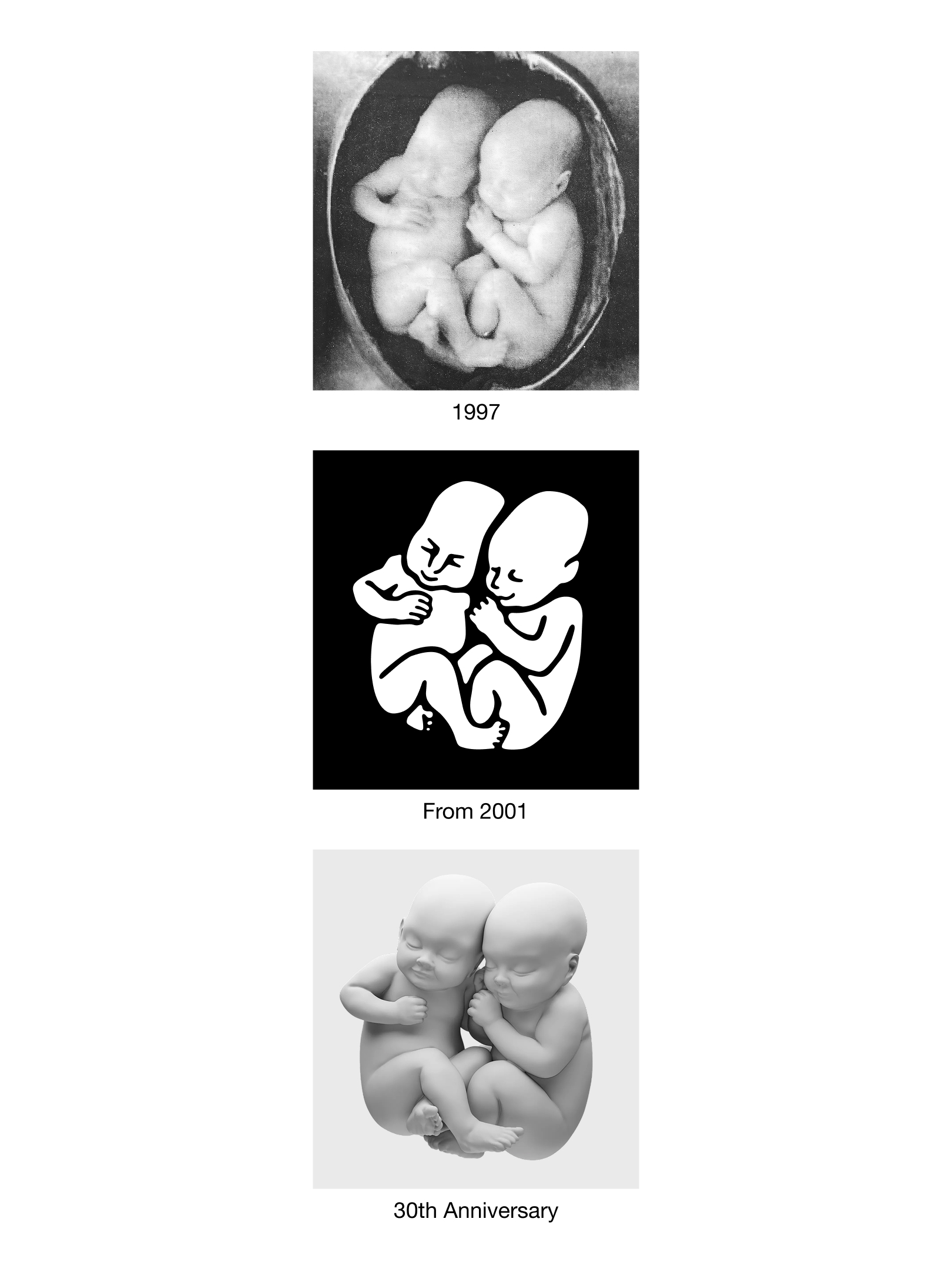 The “babies” logo perfectly captures the meaning of the Slovak word pohoda – a feeling of ease, closeness and togetherness. Two babies resting side by side evoke a pure, universal human connection, turning the logo into one of Slovakia’s most recognisable visual symbols over the past three decades.
 For the 30th edition, we returned to the image's origins — before its graphic stylisation, back to its original three-dimensional form. We created a 3D model of the iconic pair, giving volume and physicality back to the Pohoda symbol after three decades.
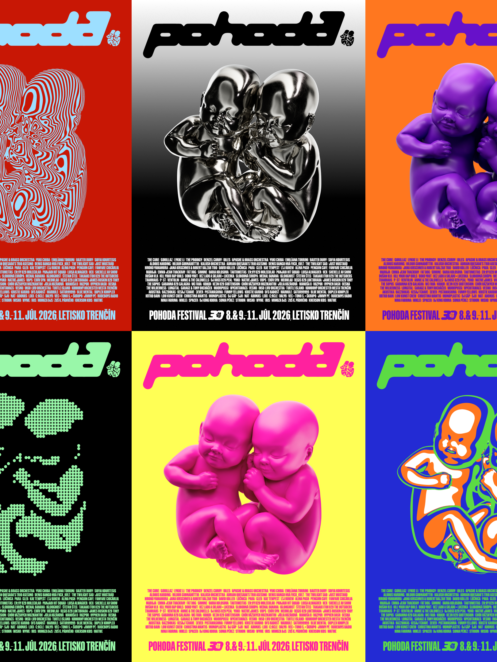
 This new model became the core building block of the identity. Rather than a single, fixed appearance, it functions as an object in continuous transformation — shifting in material, colour, texture, rendering and level of abstraction. At times sculptural and glossy, at others monochrome, reduced to lines, dots or bold fields of colour. One logo can therefore symbolize many different visual worlds – just as Pohoda itself spans multiple genres and art forms, forming a colourful, ever-changing universe of its own.
Typography
The second defining element of the identity is a custom typeface created specifically for Pohoda's 30th edition. Its origin lies in the distinctive lettering the festival used in its communication until 2010.
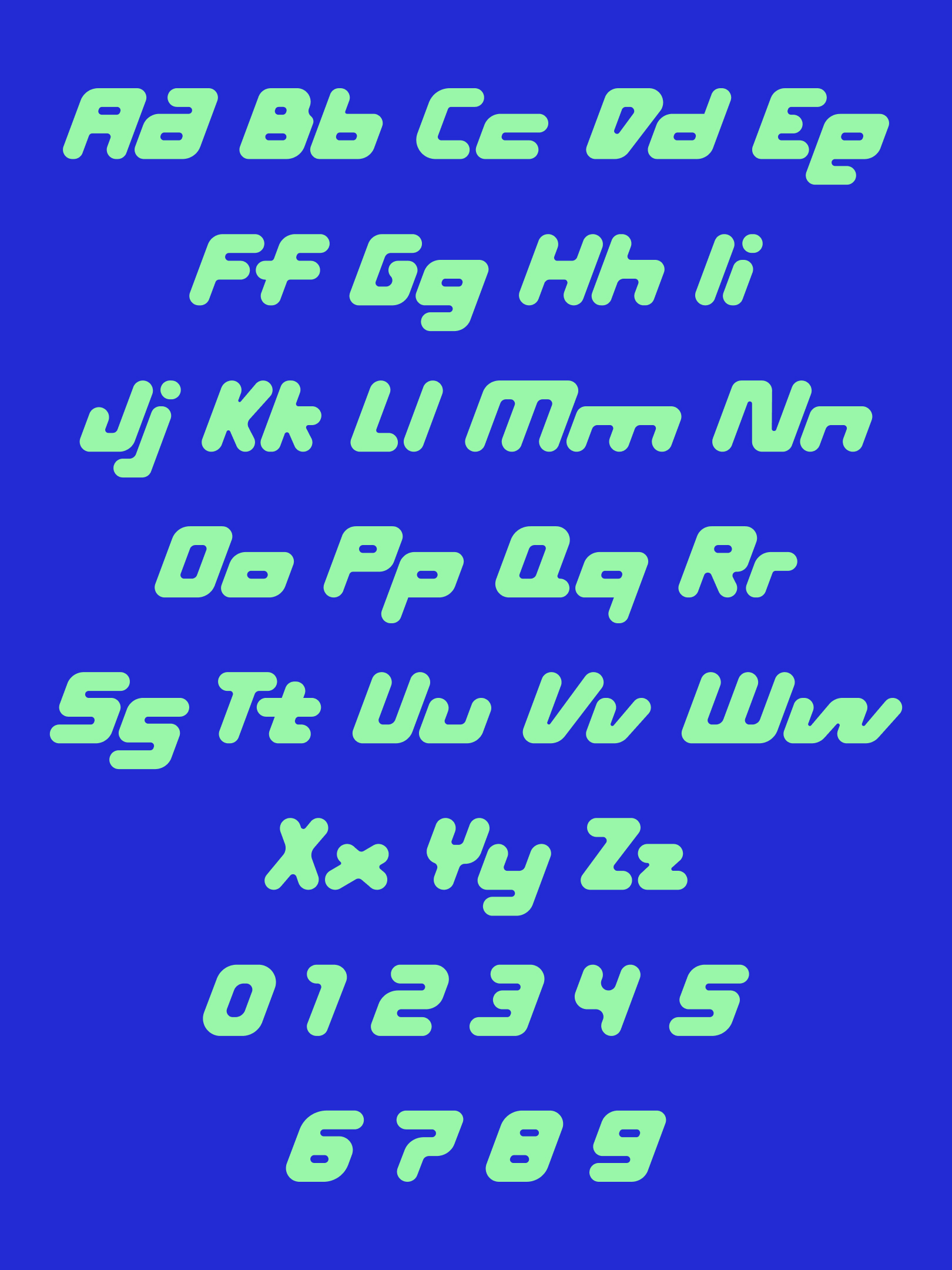 We reinterpreted this original lettering as a display typeface with geometric construction and rounded forms — first developing new Pohoda lettering, then expanding it into a complete character set designed primarily for artist announcements.
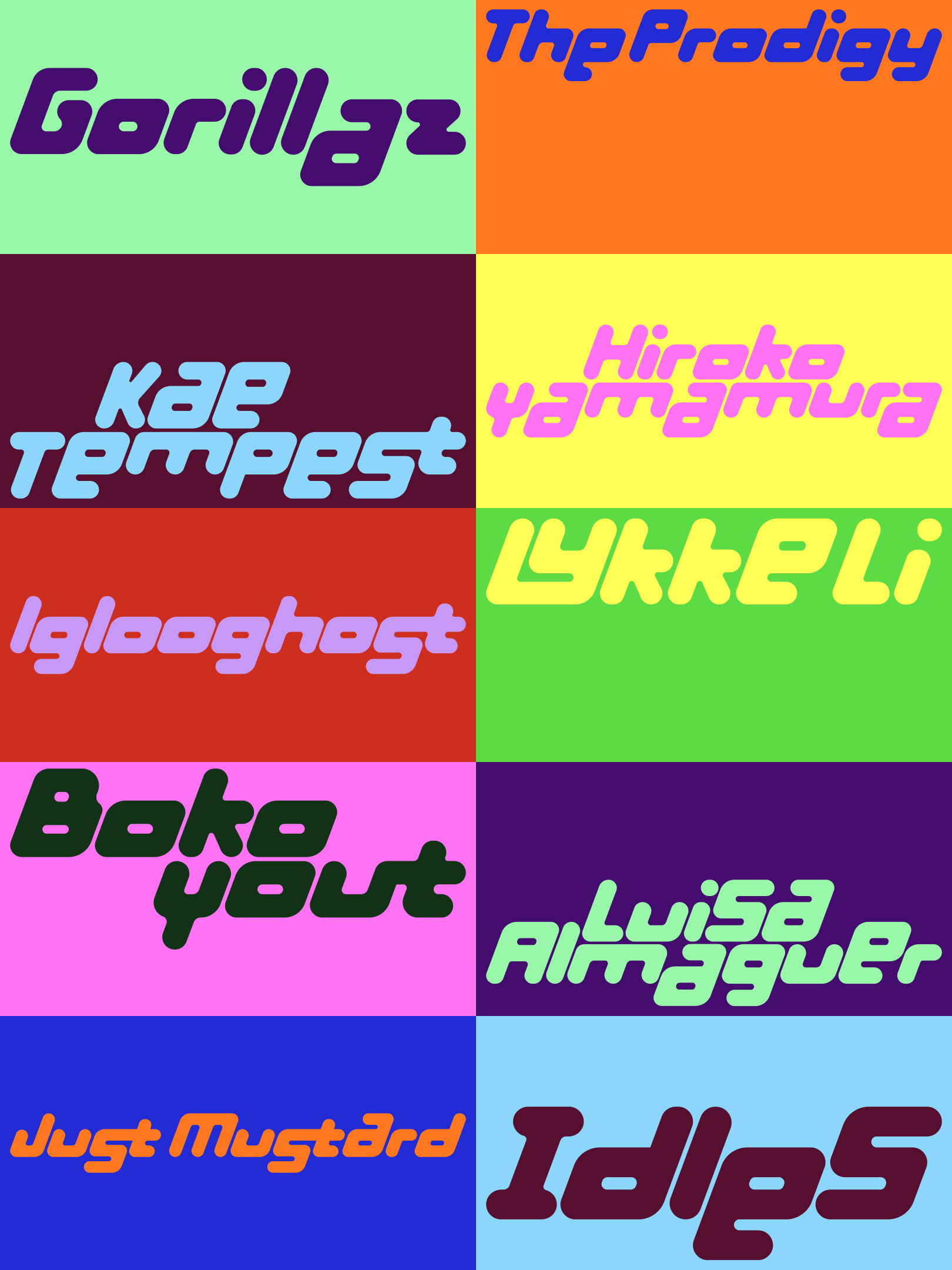 One of the typeface's defining principles is the treatment of the lowercase a, e and s. They share the height of the capitals and can align to either the upper or lower edge of the line. Artist names therefore become more than simply typeset words — each can function as an individual piece of lettering, with its own composition and rhythm.
Visual Identity
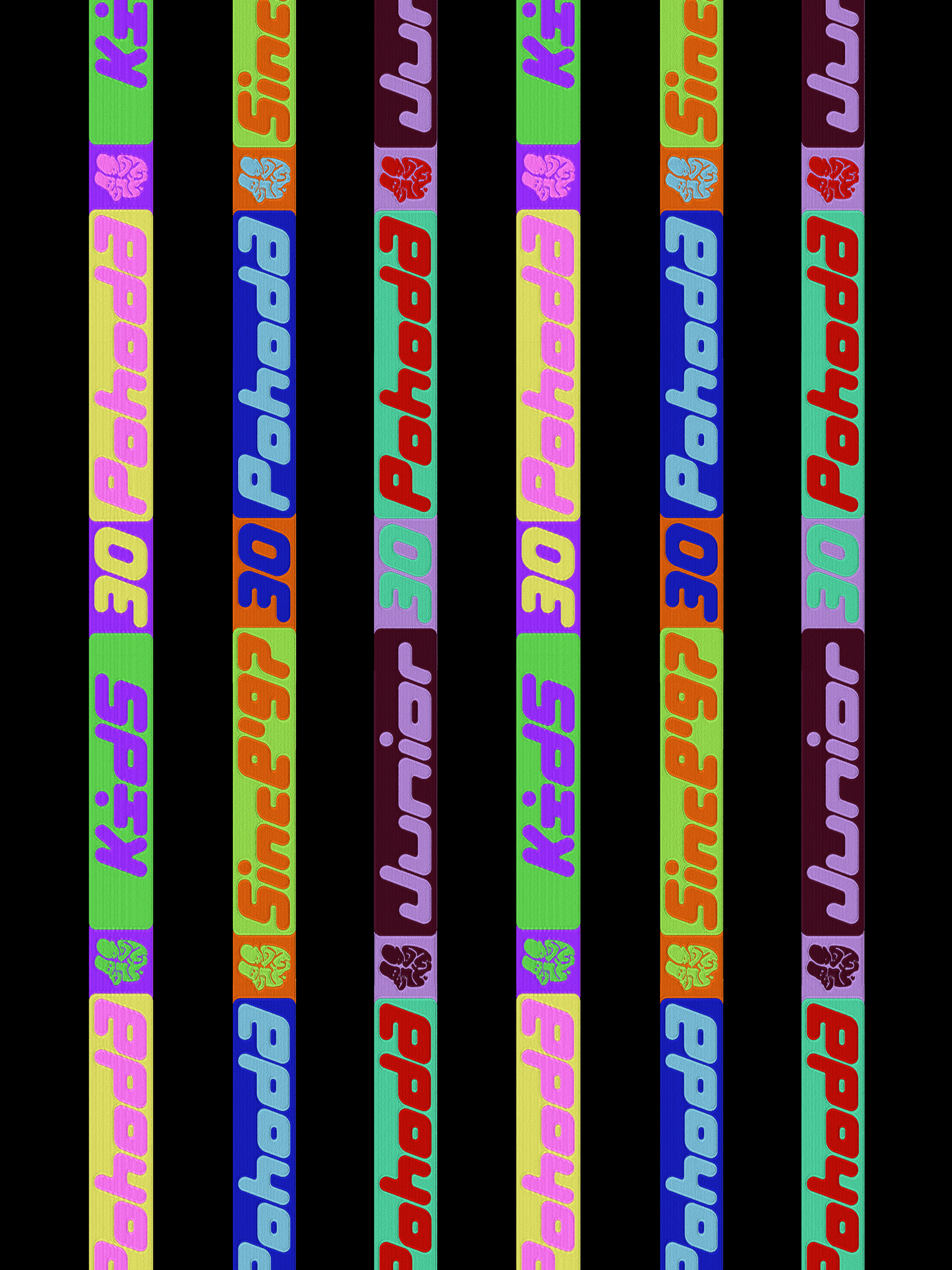
The visual identity for Pohoda's 30th edition celebrates its iconic logo, which — together with the custom typeface — forms a flexible system built on transformation, bold colour and variation. Rather than a single key visual, the result is a living, constantly changing visual language.
Merch
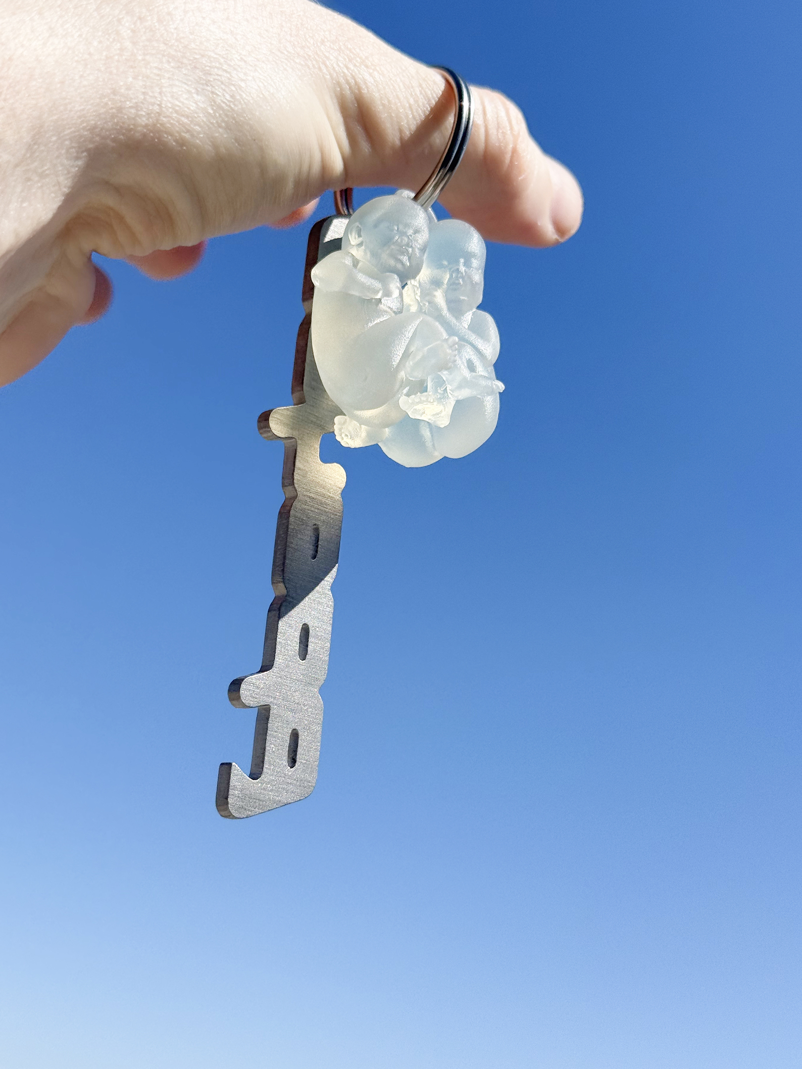
T-shirts, hoodies and other pieces were custom-made — from bespoke cuts and the origin of the cotton to the weight of individual fabrics. The collection draws on different layers of the identity: the new lettering, typography, the 3D symbol and its graphic transformations.
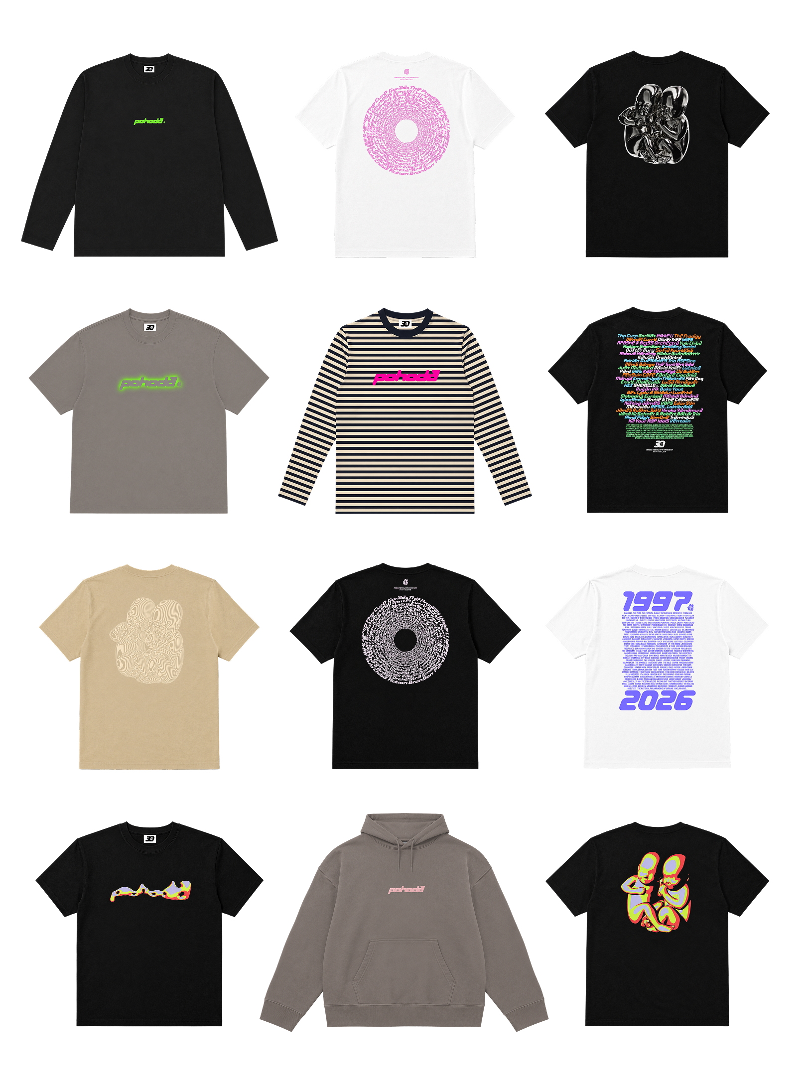 Production took place in Portugal at a GOTS-certified factory, with an emphasis on material quality, craftsmanship and sustainable production.
Creative Direction: @andrej_and_andrej
Client: @pohodafestival
Design: @gautshhh
CGI Direction: @matej_martinec
3D Model: @adela.struncova
Merch: collab with @linas @brapeeyou
Typeface: Pohoda by @andrej_and_andrej; Gravity by @abcdinamo
Photo: @jonasverespej @mpatycki @zdronu